Educational data storytelling: How can we communicate important insights into your learning dashboards?
September 1, 2021
Keywords: data storytelling, learning analytics, learning dashboards
Target readers: Designers; Researchers

Author: Vanessa Echeverria
Vanessa Echeverria is an Assistant Professor at Escuela Superior Politécnica del Litoral (Ecuador). Her research interests lie in the intersection of Human-Computer Interaction, Artificial Intelligence, and collaborative learning to support teachers and learners in their learning process.

Photo by Luke Chesser on Unsplash
Educational data storytelling: How can we communicate important insights into your learning dashboards?
In the learning analytics community, we are all familiar with visualizations and dashboards generated using data from technology-enhanced learning tools and systems. Usually, these visualizations are exploratory. They are intended to show the big picture and invite users to analyze the data, explore questions, and get answers.
But how do we guide users (teachers or learners) on where to look to get the key insights we want to convey?
What if we could provide a call-to-action message for users to take after inspecting, analyzing, and interpreting the visualization?
Borrowing ideas from data storytelling, in this blog, I introduce educational data storytelling, a technique to guide users when interpreting complex data.
First, we need to define what data storytelling is to learn how to embed these concepts into our learning visualizations.
What is data storytelling?
Data storytelling is the process of creating a story using data. For instance, journalists and data scientists from the New York Times have crafted powerful data stories to a broader audience using data storytelling. Data storytelling builds on narrative storytelling foundations and Information Visualization techniques to engage the audience and increase their attention.
While data visualizations invite users to explore, ask questions, and get answers by these, data storytelling aims to communicate insights through the combination of data, visuals, and narrative. Ideally, data storytelling will drive the users to take action based on critical information.
Summarising data storytelling’s goal and purposes, here are some key points:
Data storytelling is goal-oriented. The design of a data story should be aligned with a specific goal. This enables the identification of the data that should be highlighted.
The data story should rely on an appropriate chart type. Some charts work better for specific purposes. For example, line charts effectively show changes over time.
The data story should be reduced to essentials. It should avoid complexity by removing unnecessary data and visual elements that do not add informative value.
The data story should guide attention. Visual and narrative elements can be used to emphasize key data points to create meaning. This can be achieved by 1) leveraging visual design elements such as shape, color, text; and 2) place the data story into a narrative structure such as introduction, rising action, climax, and conclusion.
Educational data storytelling
Now that we have defined what data storytelling is, let’s see how we can combine these data storytelling key points with learning dashboards to communicate the main insights.
To illustrate the educational data storytelling approach, I present an example from prior work done in this research area. Figure 1 depicts a line chart combined with a dot chart about a team's performance in a collaborative database design activity, which was intended as feedback for the students to reflect on. In brief, the chart shows that as the activity progressed, the team added more and more elements to their database design. As can be seen, the figure has a lot of information for students to process: objects represented as dots, such as entities/attributes and relationships from an Entity-relationship diagram, and the score solution, represented as a line. But what are the key insights the students should take from this?
Figure 2 illustrates the result of applying the educational data storytelling approach. The educator’s pedagogical purposes are translated into visual elements to help emphasize and communicate key insights: identifying main objects (i.e., entities, attributes, relationships) and the score evolution during the design activity. The blue labels and boxes in Figure 2 have been added for illustrative purposes, explaining the data storytelling elements that were applied into the original visualization. The descriptive title foregrounds the main insight, only the main objects are retained in the visualization, narratives highlight key changes during the group activity, and the shaded explanatory area adds some context about the activity.
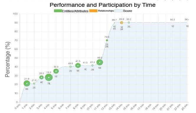
Figure 1. A visualization showing the team's performance in a collaborative activity.
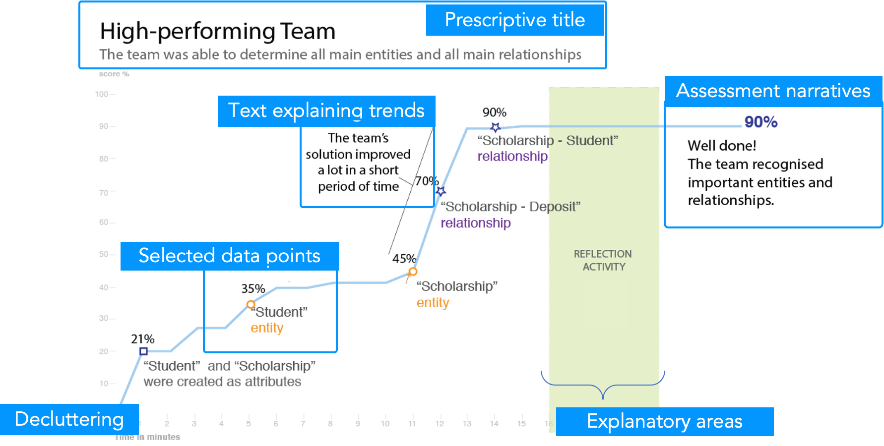
Figure 2. A visualization about team performance after applying the educational data storytelling approach. Note that blue boxes were added to point to different data storytelling elements.
How can we do this automatically?
While data storytelling techniques can be used by anyone to improve their visuals, learning analytics visuals may be dynamically generated — the story may not be known in advance. Our prior work describes four steps to generating such educational data stories automatically:
Step 1: Understanding the context. First, we must understand the data we can collect, which tools were utilized in the learning environment, what kinds of artifacts were created during the learning activity, and the interactions among different actors (i.e., teachers and students). This context can be derived by the learning design of the activity or by the user's inquiry (e.g., asking teachers what is relevant for students to learn). In this step, it is also essential that we define the targeted audience of these visuals - who will be the consumers of these learning dashboards/visualizations? Are these visualizations targeted at teachers or students?
The outcome of this step is a set of pedagogical purposes or main insights that will be represented as data stories. For example, when a group of students is designing an Entity-Relationship database model from the Student-Scholarship case study, the teacher sets a pedagogical purpose for this task: students must recognize three entities such as Student, Scholarship and Deposit as main entities of the Entity-Relationship database model.
Step 2: Translating pedagogical purposes into rules. Once we define the pedagogical purposes, the next step is to explain these with a formal language, such as rules, that can be coded in any programming language, similar to pseudo code. These rules consider the data that have been gathered from the learning environment, the expected interactions among actors and expected outcomes. For example, we can create a rule from the pedagogical purpose in Step 1 such as the following:
listOfEntities - [‘Student’, ‘Scholarship’, ‘Deposit’]
If entity is in listOfEntities:
AddPoint(concept, timestamp)
In other words: when a main entity, such as Student, Scholarship or Deposit is recognized during the task, add this as a data point in the chart.
Step 3: Mapping rules with visual elements. This step consists of mapping the rules identified in the previous step to visual elements that emphasize key data points and the call-to-action message we want the student to engage with. The visual elements can include shape, color, line, contrast, size, orientation, and position. For example, from the rule defined in step 2, we can add visual elements to highlight a key entity using colors and shapes (as in Figure 2). We can also remove unimportant entities. The table below lists some visual elements that can be used for this step.
| Visual elements | Description |
| A. Heading | Shows a straightforward message from the graph |
| B. Lines to emphasize | Emphasize relevant information |
| C. Key data points | Focus attention on critical data |
| D. Decluttering | Remove elements that do not add value to the graph |
| E. Text labels | Add narratives to the graph |
| F. Shaded areas | Add context to a group of data points |
Step 4: Crafting the visualizations. This is where we apply the visual elements and data storytelling principles into our visualizations. Once we have defined our context, intentions, and visual elements, we apply these to our visualizations. Following Knaflic’s steps for creating data stories, we select our chart type according to our data, apply decluttering, focus attention on our key insights, and give a call-to-action message.
And the moral of the story...
While there are many benefits to using data storytelling, this is not always applicable to all learning visualizations. Researchers and designers should keep in mind that data stories are helpful when insights are hard to understand due to the data complexity. For example, if we rely on multiple data sources or work with many variables in the same visual representation, it may be worth applying this educational data storytelling approach.
Data storytelling provides a way to emphasize critical insights via learning visualizations. It helps you engage with your audience and directly impacts the decision-making process. Next time you are working with data and designing your learning visualizations, consider crafting good data stories to better communicate important insights.
Learn more:
Echeverria, V., Martinez-Maldonado, R., Granda, R., Chiluiza, K., Conati, C., & Buckingham Shum, S. (2018). Driving Data Storytelling from Learning Design. In Proceedings of the Eighth International Learning Analytics & Knowledge Conference, (pp. 131-140). ACM. https://doi.org/10.1145/3170358.3170380
Echeverria, V., Martinez-Maldonado, R., Buckingham Shum, S., Chiluiza, K., Granda, R., & Conati, C. (2018). Exploratory versus Explanatory Visual Learning Analytics: Driving Teachers’ Attention through Educational Data Storytelling. Journal of Learning Analytics, 5(3), 72—97. https://doi.org/10.18608/jla.2018.53.6
Echeverria, V., Lawrence, L., Tsai, Y.-S., Singh, S., Fernandez-Nieto, G., & Martinez-Maldonado, R. (2021). Data Storytelling for Learning Analytics Dashboards. LAK21 - Tutorial.
Knaflic, C. N. (2015). Storytelling with data: A data visualization guide for business professionals. John Wiley & Sons.
Martinez-Maldonado, R., Echeverria, V., Fernandez Nieto, G., & Buckingham Shum, S. (2020). From data to insights: a layered storytelling approach for multimodal learning analytics. In J. McGrenere, & A. Cockburn (Eds.), Proceedings of the 2020 CHI Conference on Human Factors in Computing Systems, Association for Computing Machinery ACM. https://doi.org/10.1145/3313831.3376148