How data presentation can help (or hurt) student motivation
October 29, 2020
Keywords: Student dashboards, Student motivation
Target readers: Educator; Instructional Designer

Author: Stephen Aguilar
Stephen Aguilar is an assistant professor of education in the educational psychology concentration at USC Rossier School of Education. At the Pullias Center for Higher Education, he works with the Digital Equity in Education team. His areas of expertise include motivation and self-regulated learning as they relate to the design and implementation of educational technologies. He specializes in learning analytics, data visualizations, and gameful approaches to teaching and learning.
His research focuses on the design, efficacy, and motivational implications of learning analytics-based applications, and how they can be used in ways that promote social justice and educational achievement among ethnic and racial minority students. Specifically, Aguilar studies how data visualizations of academic achievement influence students’ academic motivation and self-regulated learning strategies. He was also awarded funding from the American Educational Research Association (AERA) to study how Hispanic students’ sense of control contributes to their post-secondary achievement and aspirations.

Photo by JEShoots on Unsplash
Dashboards and Academic Motivation
Often, before students talk to their instructors about their progress in class, they log into the learning management system (LMS) to see how they are doing.
Increasingly, LMS products offer information-rich “dashboards”, making this the first message students see about how they’re doing. Designed well, dashboards help students succeed academically. Dashboards can also, however, unintentionally undermine students’ academic motivation. This is potentially disastrous, because before learning happens, students must be motivated to learn. Academic motivation is important because it encourages students to engage with coursework, even when it is challenging.
I study how and why this happens by looking at the role that visualizations (like bar-charts and line-graphs) play in the motivational processes of students. I’ve paid particular attention to how visualizations can impact students who are at-risk of struggling academically. Over the years, I have landed on a few recommendations that are worth keeping in mind when deciding what information to present to students through LMS dashboards. They are:
- Never assume that more information is better
- Anticipate and mitigate against potential harm
- Always suggest a way for students to improve
Never assume more information is better
There is an understandable tendency to find, acquire, analyze, and communicate (i.e., visualize) any and all data that may be relevant to students. When choosing which information to communicate to students, however, one should take special care to not inundate students with information that may decrease their motivation to engage in class.
For example, I’ve found that often students may not need more information to learn more. In fact, more information may actually be harmful to their academic motivation. The more information in a visualization, the more ways it can be interpreted. This can include interpretations that diminish students’ motivation in school.
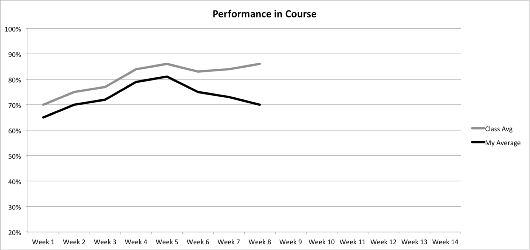
In the graph below, for example, you can’t but help interpret your average relative to the class average. The graph drives your visual attention to make this comparison.
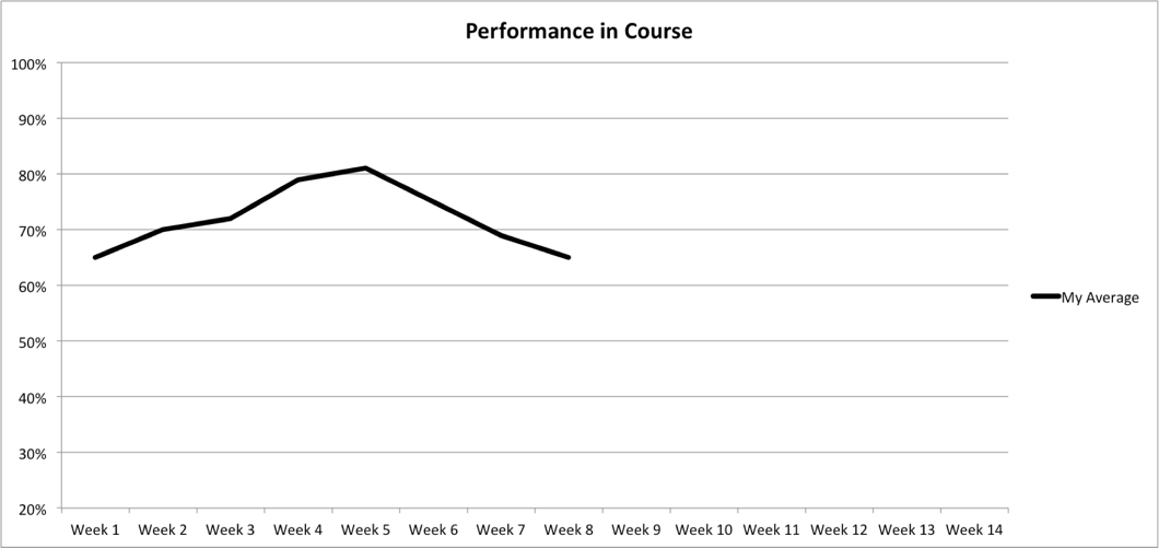
Contrast that with the same information displayed below, which does not show the class average. In the second graph interpretations shift, and a student cannot, by design, compare themselves to the class average at all, just to their own performance.
Examining the influence of visualizations on academically at-risk students has shown that visualizations containing information about students and a class average (i.e., comparative information) evoke either responses that dishearten students or made them feel accountable to do better.
One way to interpret visualizations is to see them as “texts” that are to be “read” by students. In the same way that a text can have an embedded meaning, a visualization can have one as well. I suggest that Teachers and designers attend to and anticipate those meanings. it’s a good idea to understand as many of the potential meanings as possible — before students are exposed to them. Better yet, ask students how they are interpreting visualizations, both before a class-wide deployment and when they are used.
Anticipate and mitigate against potential harm
This leads to my second guideline: anticipate and mitigate against potential harm. Good visualizations help, not hinder, a student’s ability to learn. When visualizations do harm, however, the harm can be socioemotional, academic, context specific, and student-specific.
Student A, for example, may wish to see a visualization that shows comparative information (like the first graph), but comparative information may lead that student to attribute failure to an uncontrollable source, which will be demotivating. They may instead benefit more from self-focused visualizations (like the second graph).
Student B, on the other hand, may not wish to see comparative information that may actually hold them accountable. Understanding motivational implications for each student, then, is paramount and may require collecting additional information from students themselves.
Accountability and a sense of ownership over one’s learning are not, of course, bad things per se — the question is how to motivate different kinds of student in ways that lead to improvement. One size doesn’t fit all.
Always suggest a way for students to improve their performance
Regardless of the visualization used, my third recommendation serves as a check for designers and teachers. Comparative information like the first graph may only be harmful to certain students, and only if those students see their failures relative to their peers as a dead end. If failure is detected, visualized, and communicated to students, then a way to mitigate, eliminate, or otherwise address failure ought to also be made available.
A struggling student may, for example, need to see the class average because the course imposes a curve, thus tying each students’ performance to that of his or her peers. A comparative visualization could supply this information to contextualize a students’ performance. This would be fine, so long as additional resources were also recommended if a student was struggling. Each student in would, hypothetically, have their own personalized set of triggers for this information to be displayed. Conversely, the resources themselves could be personalized.
To sum up... know your design context
Good visualizations help, not hinder, a student’s ability to learn. Effectively designed graphs and/or other visualizations have the potential to give students personalized information they need, when they need it, rather than generic information that may not be relevant to them. I’d like to encourage teachers and designers in this space to be mindful of how academic information is represented. The last thing you want to do is de-motivate students on a large scale!
I’ll close by suggesting four strategies.
1. The classic software approach is to give the user a preferences control panel: in apps, one size doesn’t have to fit all. If by logging in to be confronted by a graph reminding a student of how poor they are doing compared to everyone else fills them with dread, let’s swap that for something they find more motivating. This allows for student agency and choice and lessens the emotional impact of such feedback. But is it okay for students to set preferences that could, in fact, undermine their learning?
After all, some students simply don’t like being stretched and challenged, so should we comply with their wishes? What if students make uninformed, poor choices? Who gets to decide? There is no simple answer here, but the next strategy provides one way to resolve this.
2. Gather student preferences, but keep teachers in the loop. Then, if necessary, they can advise. Designers can help teachers do this by, for instance, providing a student survey tool to gather their preferences (see below for some additional reading on this).
If a student is making questionable choices (in the teacher’s opinion) that’s something that can be discussed (also cultivating student data literacy and reflection).
For example, if a class imposes a curve, then by design, half of the students will be at or below average, regardless of how much of the material they’ve mastered. This can have profound motivational implications
3. Align design decisions with other pedagogical factors (such as the course learning design, or grading philosophy). If possible, designers can partner with institutional research units of their schools to bring such insights to bear when designing student-facing visualizations.
This opens up the important question of how much control an institution has over the dashboard, and what capacity they have to make changes. This requires partnership between the dashboard providers (vendors or open source), researchers, and educators.
4. Finally, no matter what design-decisions are made, it is important to collect and analyze students’ behaviors within the LMSs so that future designs can be informed by how students reacted to previous implementations.
To learn more…
Stephen J. Aguilar (2018). Examining the Relationship Between Comparative and Self-Focused Academic Data Visualizations in At-Risk College Students’ Academic Motivation, Journal of Research on Technology in Education, 50:1, 84-103. https://doi.org/10.1080/15391523.2017.1401498
Stephen J. Aguilar & Clare Baek (2018). Motivated information seeking and graph comprehension among college students. Proceedings of the 9th International Conference on Learning Analytics & Knowledge (LAK’19) https://doi.org/10.1145/3303772.3303805
Steven Lonn, Stephen J. Aguilar, S.J., & Stephanie D. Teasley (2015). Investigating student motivation in the context of a learning analytics intervention during a summer bridge program. Computers in Human Behavior, 47, 90-97. https://doi.org/10.1016/j.chb.2014.07.013